reKro
Matching international students to their forever home.
reKro is a student-led startup in Sydney, Australia that provides secure and accessible housing for international and domestic students.
During my UX Design internship at reKro, I contributed across the full product lifecycle, from research and high-fidelity product design to branding, design systems, and marketing assets. My work focused on improving discoverability, usability, and visual consistency across the app, web landing page, and App Store presence.
Scope: Research, UI design, prototyping, branding, design systems, product marketing assets
Role: UX-UI Designer
Tools: Figma, Framer, Procreate, and Canva
Timeline: June 2025 – August 2025 (Summer Internship)
Contributions:
- Conducted comparative and usability research across housing platforms
- Designed high-fidelity mobile app screens and prototypes
- Led App Store listing design and marketing visuals
- Helped modernize reKro’s brand and establish a design system
- Designed the second iteration of the web app landing page
Final Designs
Hi-Fidelity App Designs


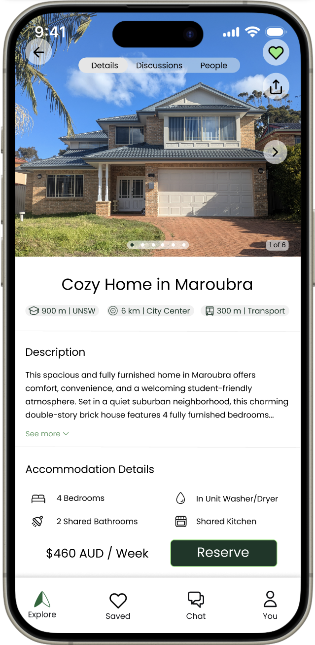
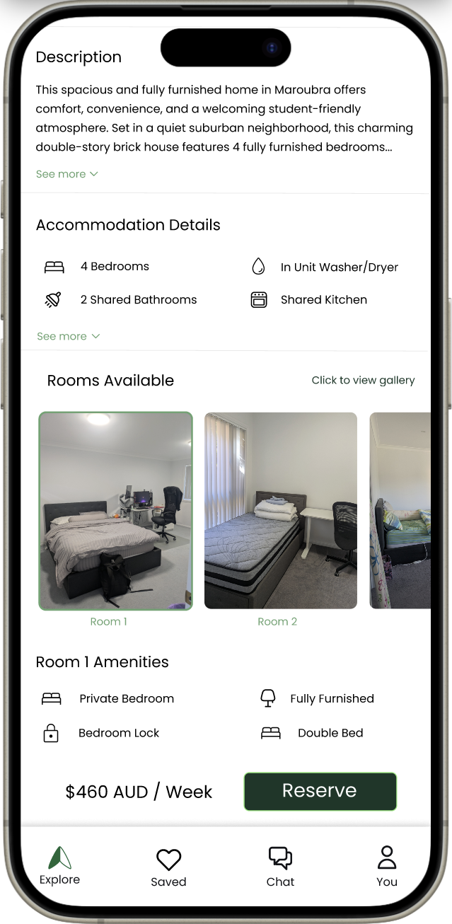

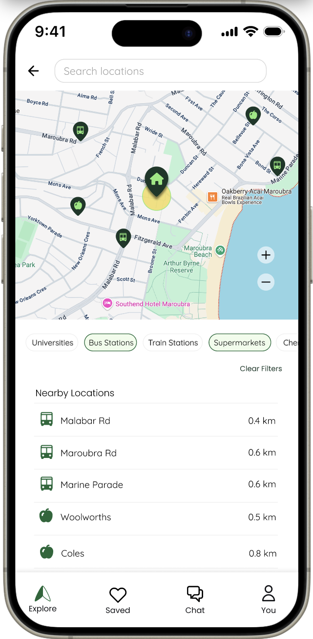
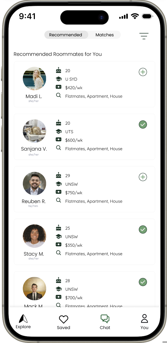
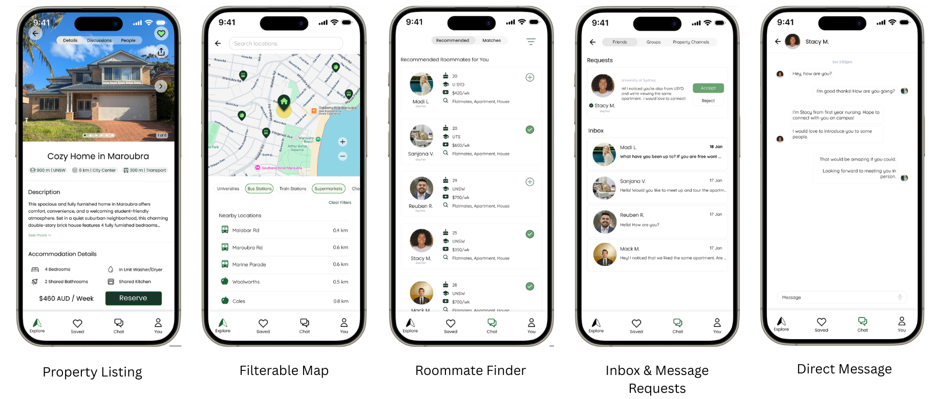
These screens represent the progression from early ideation to high-fidelity designs, supporting the final app listing page experience. (see below)
Landing Page Iteration
First iteration of the high-fidelity landing page for reKro’s web app. This iteration was created to establish the visual direction and showcase key features of the newly released app.
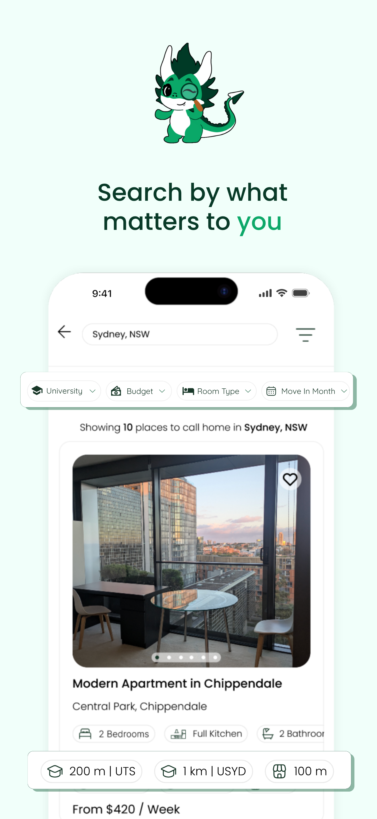
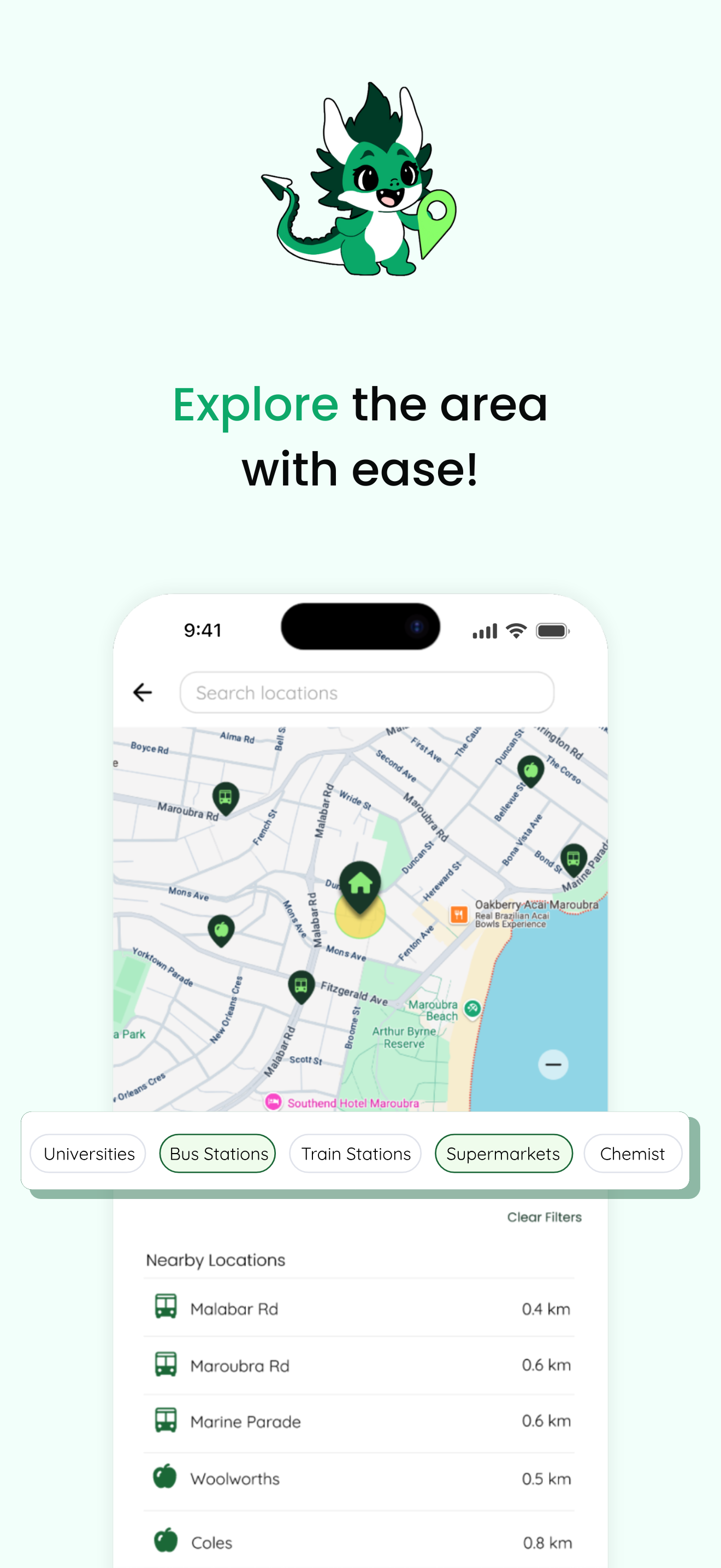
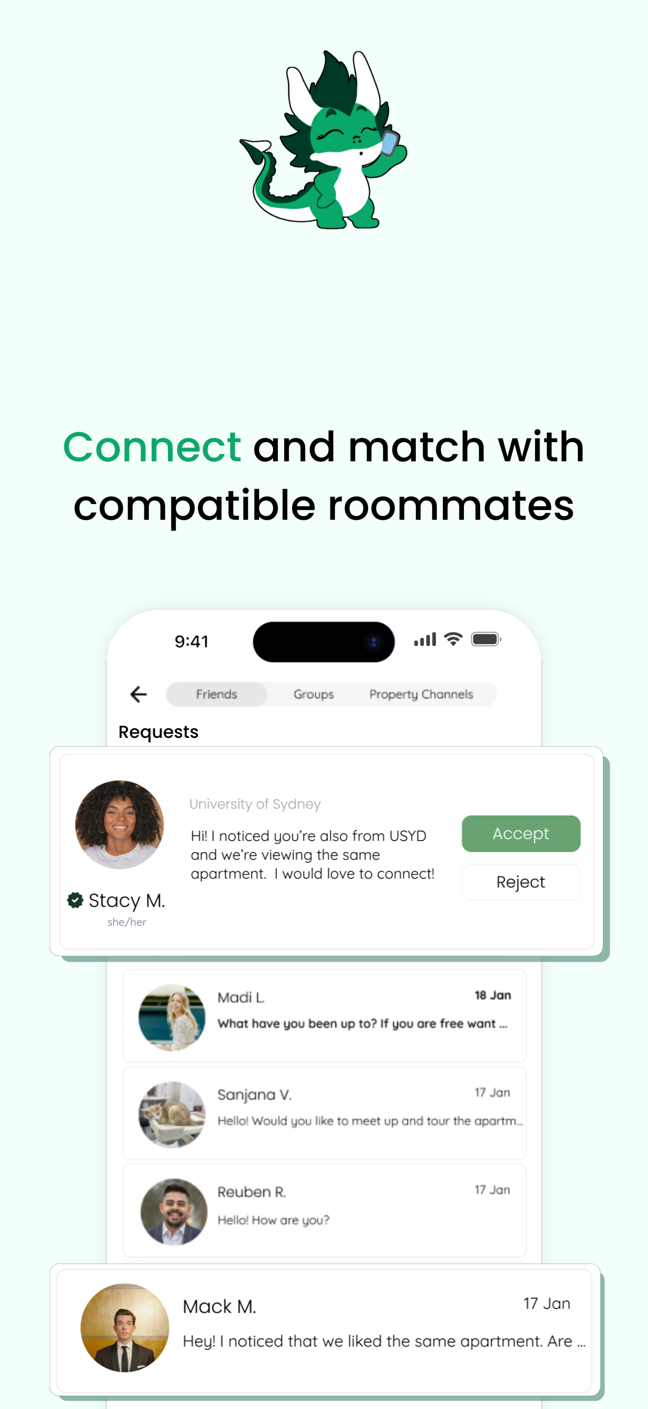
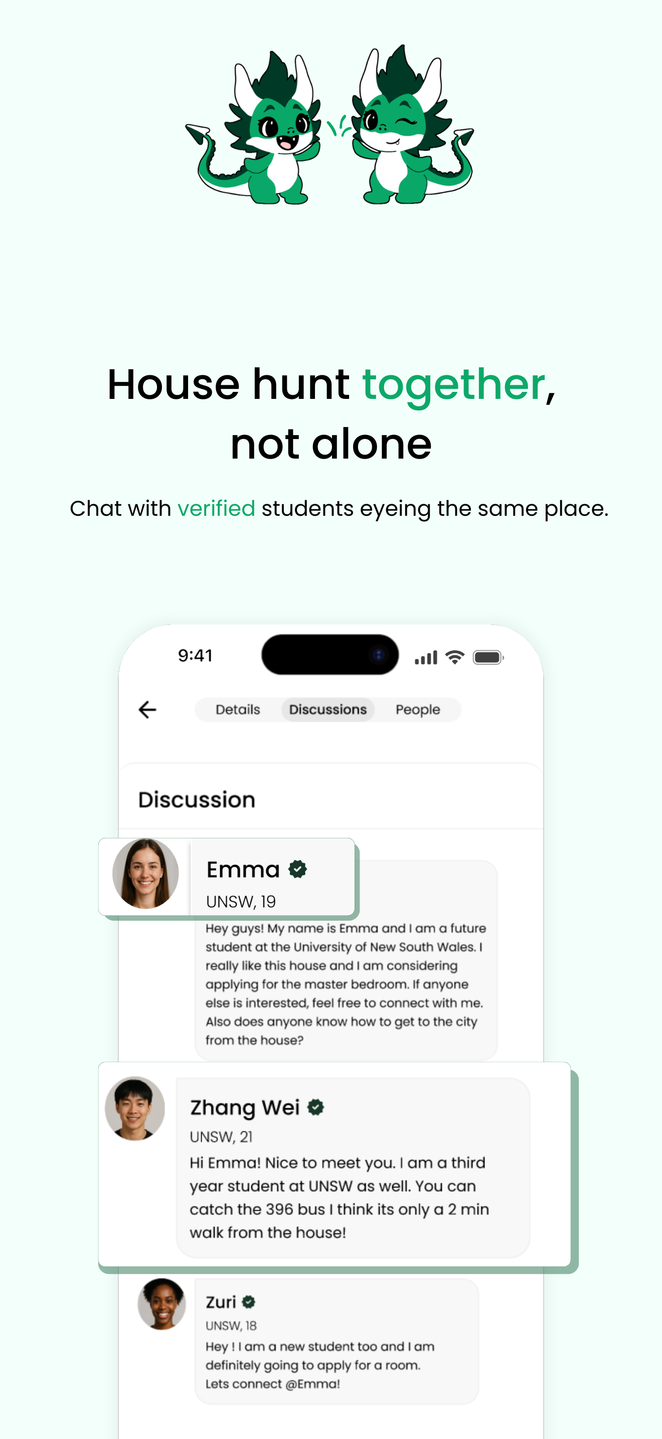
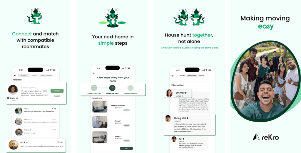
App Listing Screens (Apple and Android)


The Goal

Create a seamless onboarding experience for reKros users

Empower students to utilize reKro
for their housing needs

Who We Are Designing For
International students moving to Sydney, Australia, need housing.
Internship Milestones
To structure this internship into clear, actionable goals, I established four key milestones to help guide my progress.
01.
Exploration & Design Iteration
Understand reKros current platform and gather inspiration from competitive analysis to further shape the platform
02.
Hi-fi Prototype Creation
Convey new design ideas gathered from competitive analysis and put into a comprehensive hi-fi design using Figma
03.
Redesign Landing Page of Webapp
Create a new landing page for reKros website that features the newly designed hi-fi app screens and showcases reKros capabilities
04.
Product Marketing & Design Systems
Established style guide. Created the app screen listing pages for the Google Play Store and Apple App Store
01. Exploration & Design Iteration
Determining the User Journey
reKro had a low-fidelity app created. I was tasked to break down the different user flows within the initial app to identify the gaps within the user flow and find ways to simplify the user journey.

20 different flows of the low-fidelity application were identified
Research and Discovery
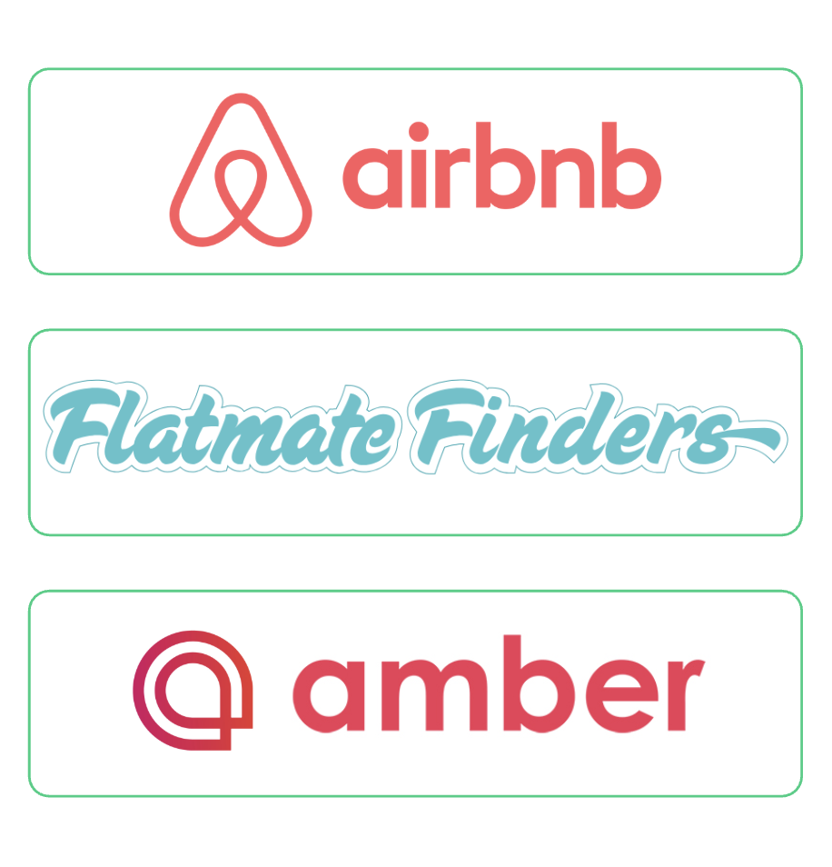
To better understand the housing and roommate-matching landscape, I conducted a comparative analysis of six platforms
Comparative Analysis: To better understand the housing and roommate-matching landscape, I conducted a comparative analysis of six platforms (Amber, Flatmate Finders, Airbnb, and others) to understand industry standards and UX patterns. The analysis focused on…
- How apartment listings were presented
- The essential information included in roommate profiles
- The structure of messaging flows.
In parallel, we ran usability testing on these platforms to identify navigation pain points, usability issues, and moments of friction. Findings were synthesized and prioritized using dot voting, helping the team align on the most impactful features and UX patterns.
Together, these activities informed key design decisions and revealed opportunities for how reKro could be expanded and improved in the next phase of development.
02. Hi-fi Prototype Creation
Insights from research were translated into early feature concepts and screen explorations. This phase focused on designing prototypes that:
- Improve how users scan and compare listings
- Highlight convenience and location-based information
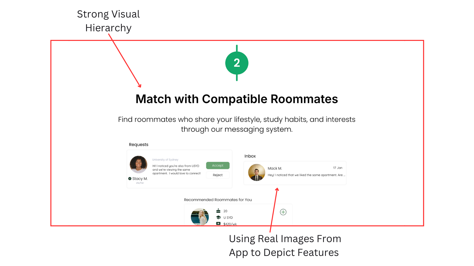
- Clarify roommate profiles and compatibility cues
From this research, I created high-fidelity prototypes to further conceptualize these key features and support future development, including use in the Apple App Store and Google Play Store listings.
*Prototypes designed in Figma
03. Redesign Landing Page of Webapp
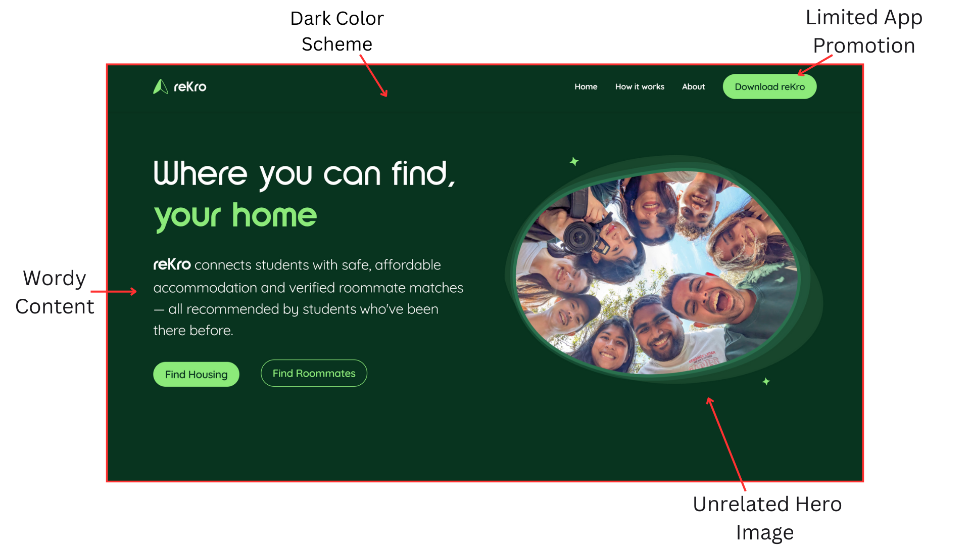
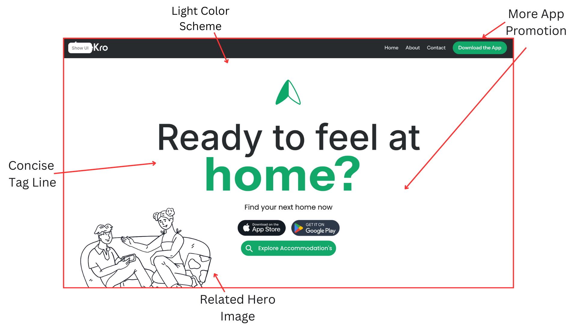
I was tasked with designing the web app landing page for the second iteration of the reKro app.
To inform the design, I analyzed existing web app landing pages to understand effective layouts and content hierarchy.
Using reKro’s established branding alongside newly designed high-fidelity app screens, I created a landing experience that clearly communicates the product and its value.
Primary goals
- Drive users to download the app via the App Store and Google Play
- Showcase key app features and functionality
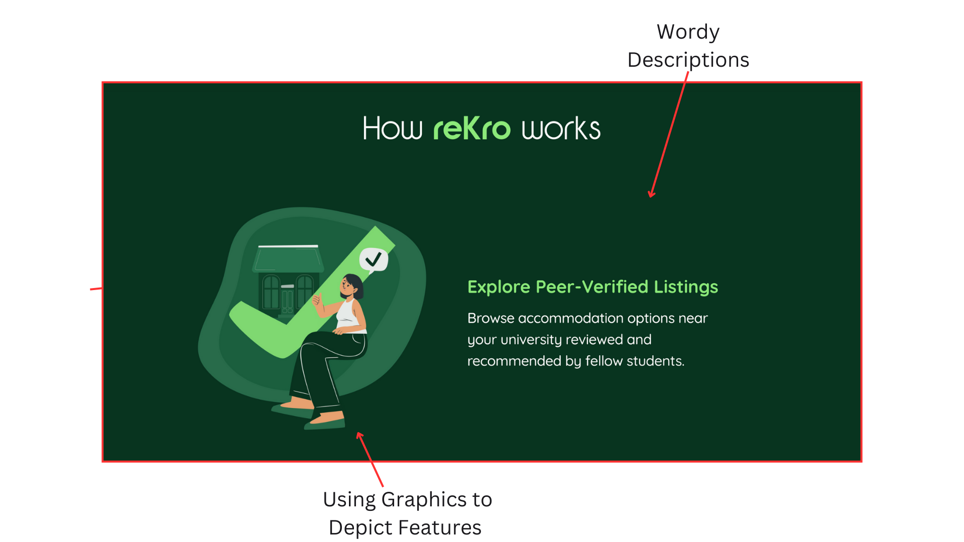
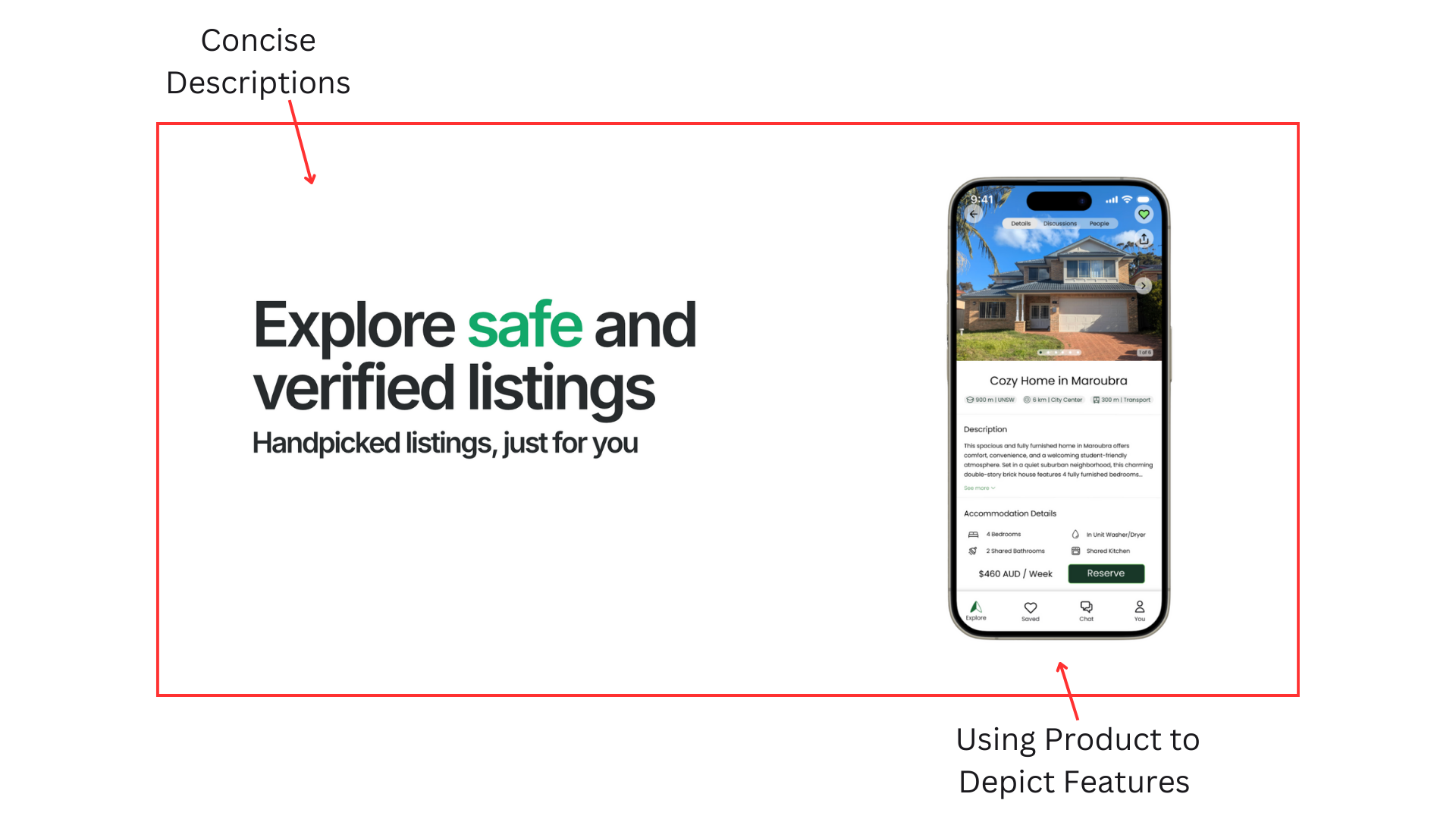
The original reKro website also relied on a very dark color palette. As part of this iteration, I refreshed the visual direction to create a more professional, cohesive, and approachable appearance while maintaining brand consistency.
*Landing page created using Framer
Slide to see the before and after changes…

04. Product Marketing & Design Systems
App Store Listing
Following the creation of the high-fidelity app screens, I led the design of reKro’s App Store listings.
I approached the work by researching successful App Store listing patterns, iterating through multiple design directions, and incorporating feedback from stakeholders.
In parallel, I helped establish visual consistency across marketing assets, laying the groundwork for a scalable design system.


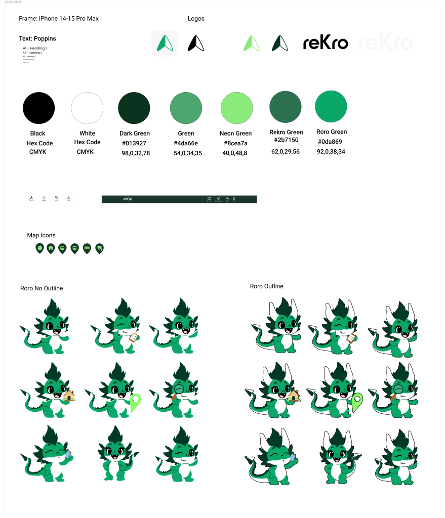
Design System
I refined reKro’s avatar illustration in Procreate to create a more modern, approachable visual identity.
I then established a foundational design system in Figma, defining logo usage, color, typography, and brand guidelines to ensure consistency across the app, web experience, and marketing assets.
Thanks for Reading!
Let’s Get in Touch
madiloyd@icloud.com
