Purdue Galleries
Reimagining the Purdue Galleries Website.
The Purdue Galleries website is a central resource for discovering exhibitions, events, and opportunities within Purdue’s art community, serving as a primary connection between student artists, galleries, and campus audiences.
Problem
The existing Purdue Galleries website made it difficult for students to discover exhibitions and engage with campus art due to its confusing UI and distribution of information.
Outcome
My team and I redesigned the Purdue Galleries website to improve usability, accessibility, and awareness of the several gallery spaces across campus.
Tools: Figma, HTML, CSS, and Cascade
Role: UX-UI Designer
Tools: HTML/CSS, Cascade CMS, Figma
Timeline: February 2025 – June 2025
(Semester Internship)
Contributions:
- Coded the Exhibitions page using HTML & CSS
- Designed the Exhibitions and Individual Exhibitions pages via Cascade
- Conducted Primary and Secondary research
- Led codesign testing sessions
- Facilitated primary communication with internship supervisor
How this Internship Emerged
This internship was formed from two research-driven academic projects focused on understanding student needs on campus.
The work began in my ANTH 384 Designing for People class, where ethnographic research revealed that many student artists felt like there was a lack of art information found around campus. These insights informed a second-year UX Design Learning Studio CGT 27108 project, where my team redesigned the Purdue Galleries website to improve usability, accessibility, and engagement using HTML and CSS.
Through user interviews, usability testing, and co-design sessions with Purdue students, we identified opportunities to better connect students with campus galleries. Our team shared this work with the Head Curator of Purdue Galleries, who saw its potential and invited us to develop the project into a real solution. This collaboration ultimately laid the foundation for the Purdue Galleries Internship, transforming our academic project work into an impact-driven internship and full redesign of the website.
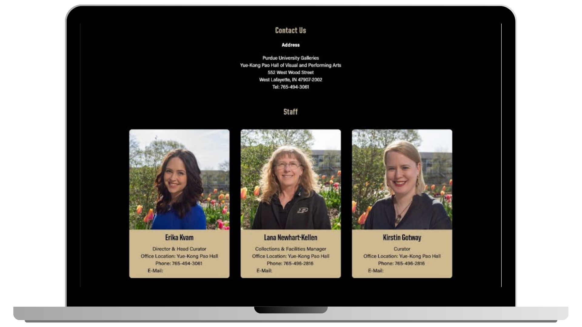
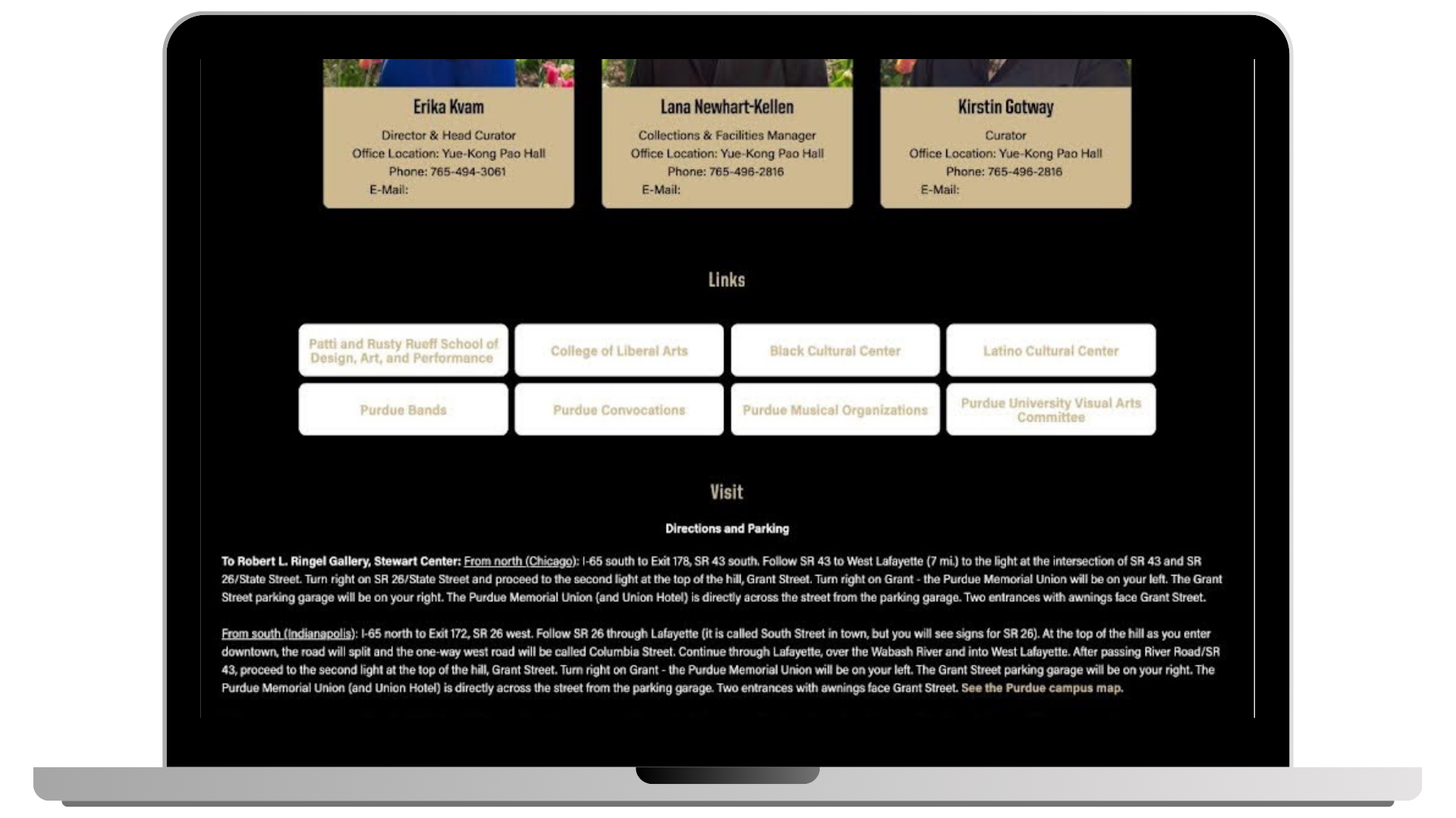
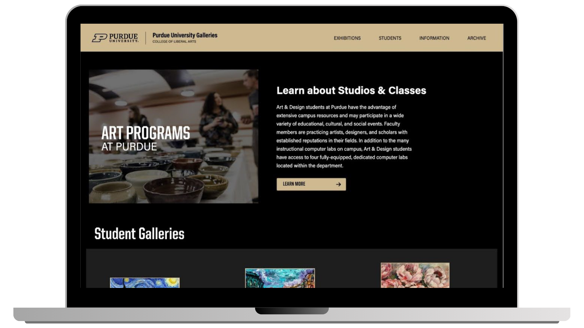
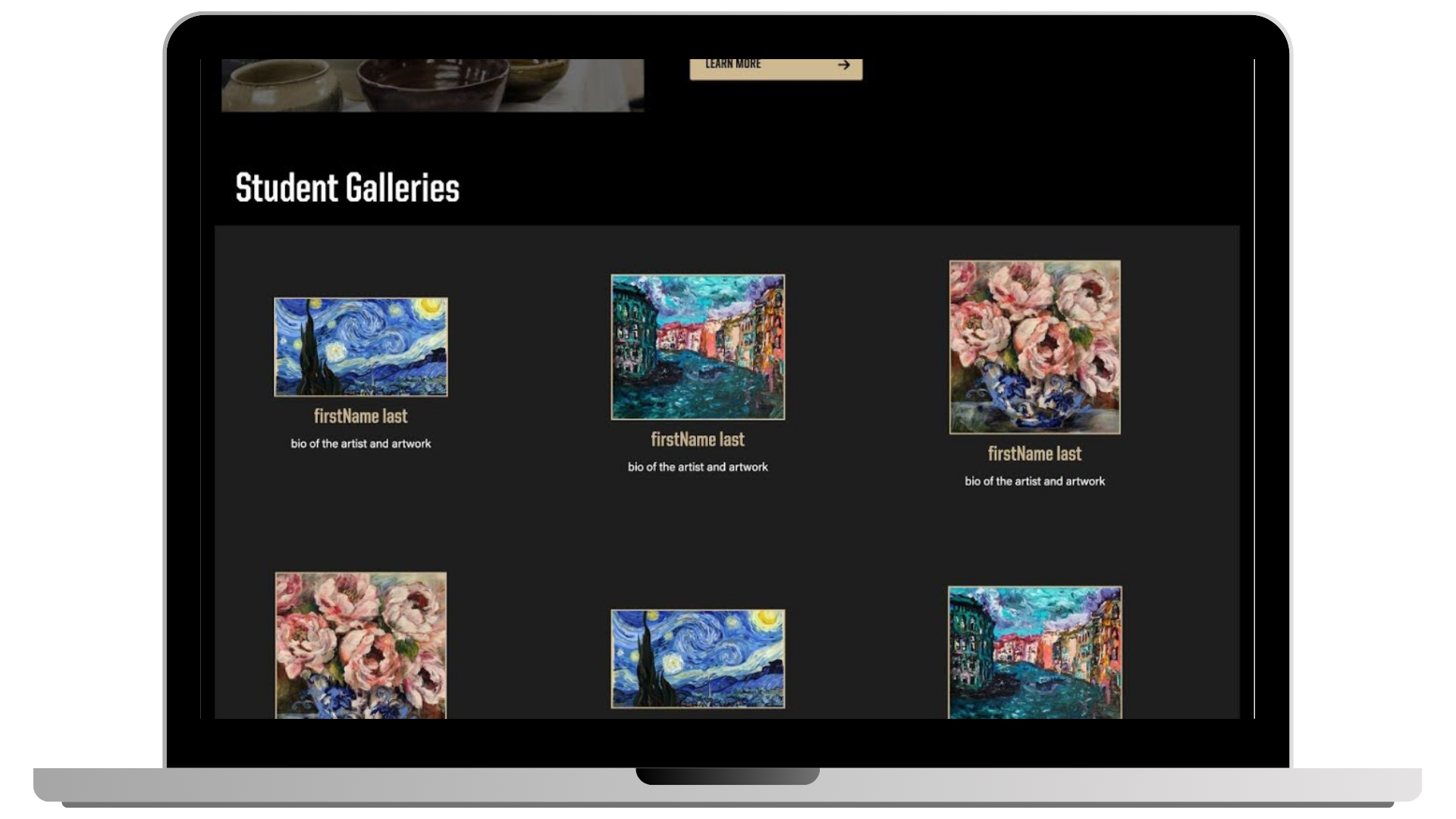
Final Designs
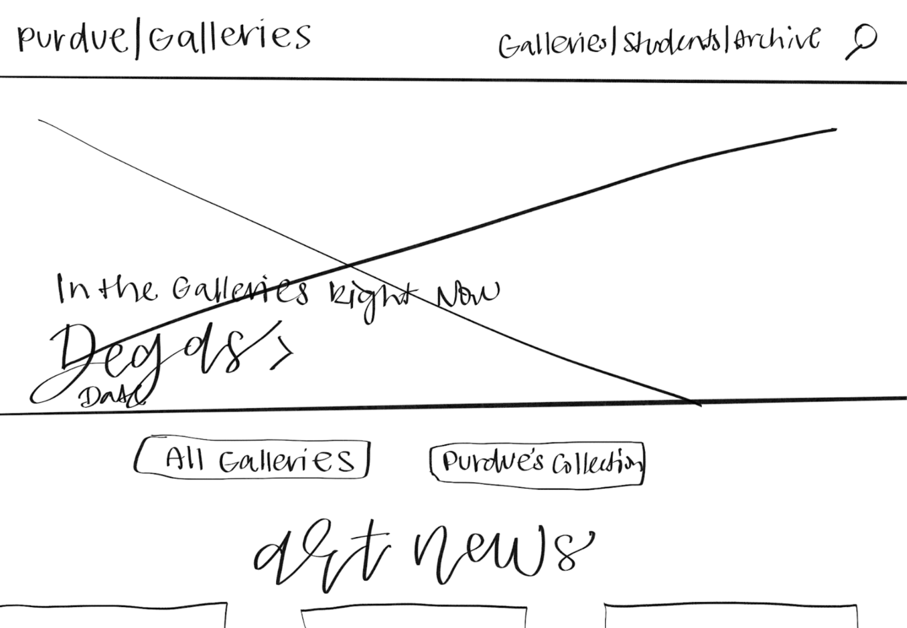
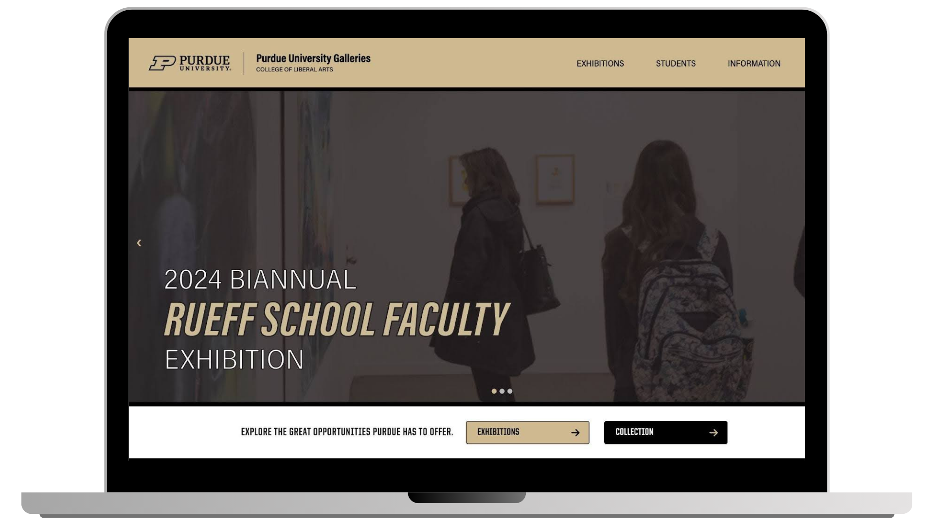
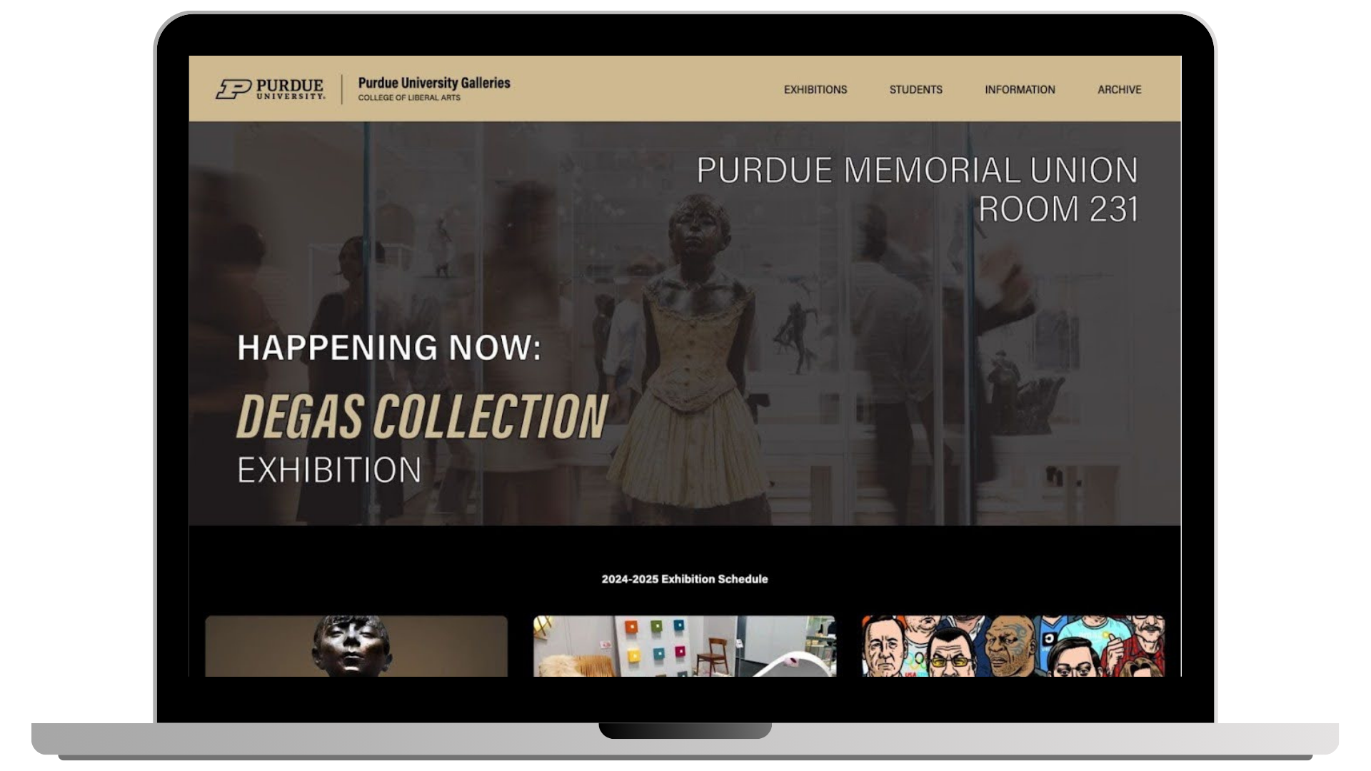
Landing Page:
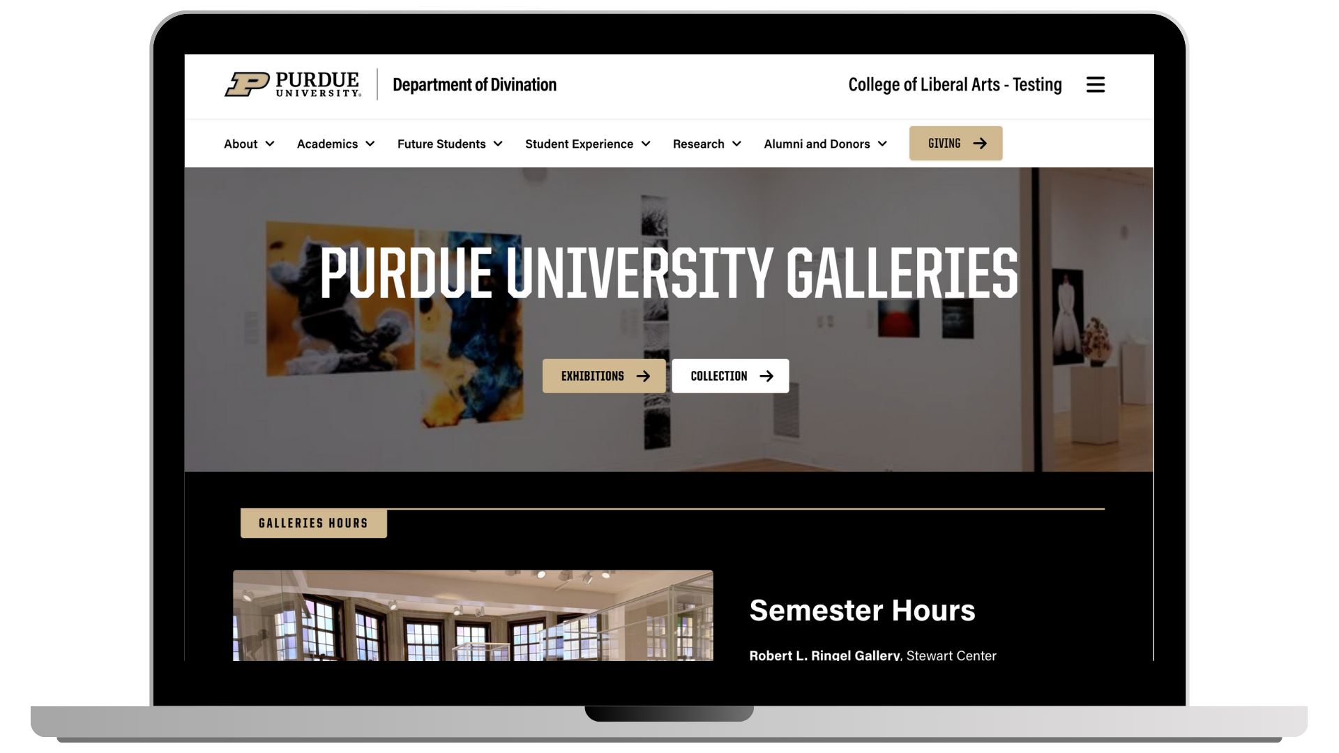
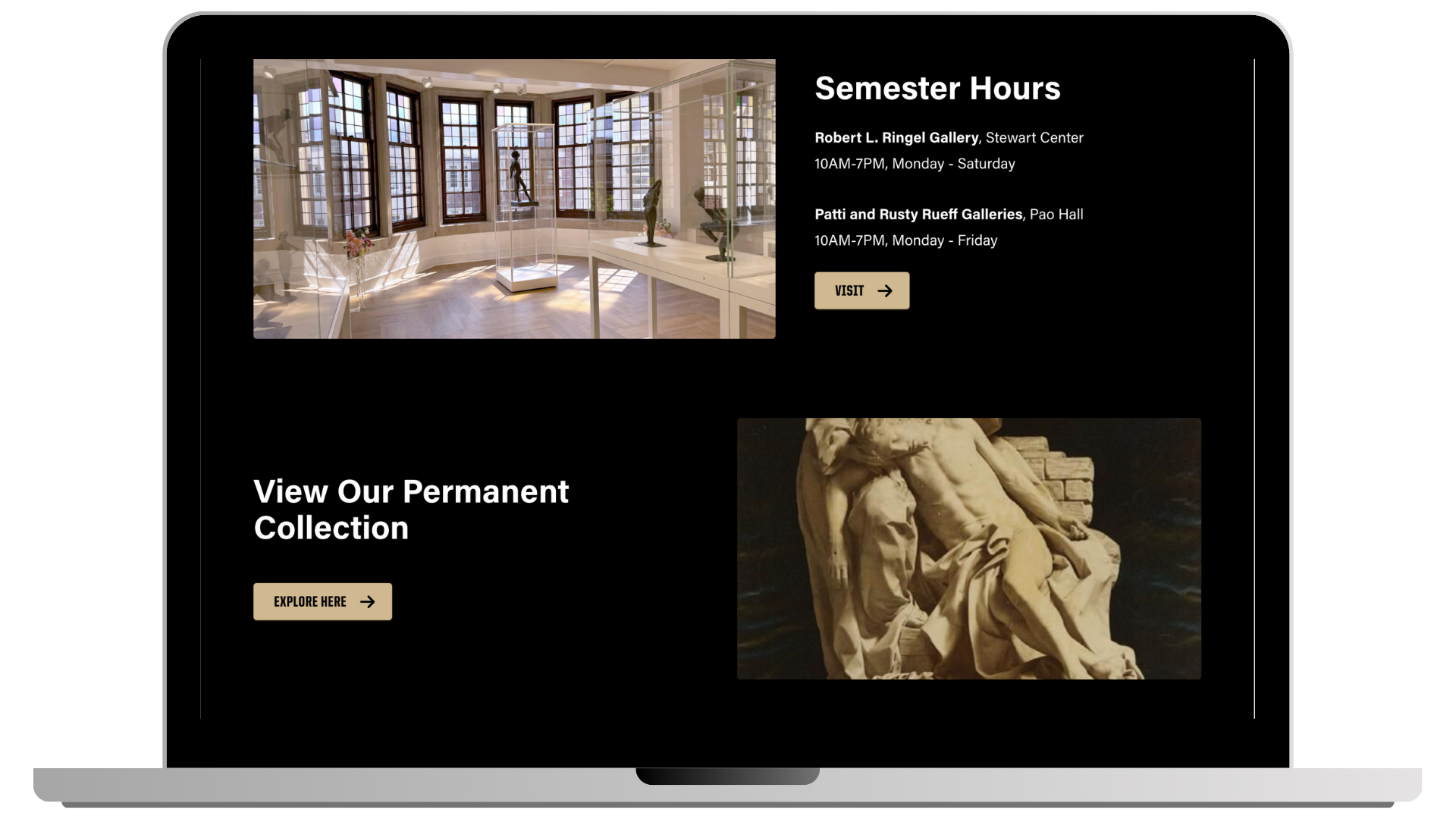
The main entry point for students and visitors to explore gallery offerings and navigate to exhibition-related content.
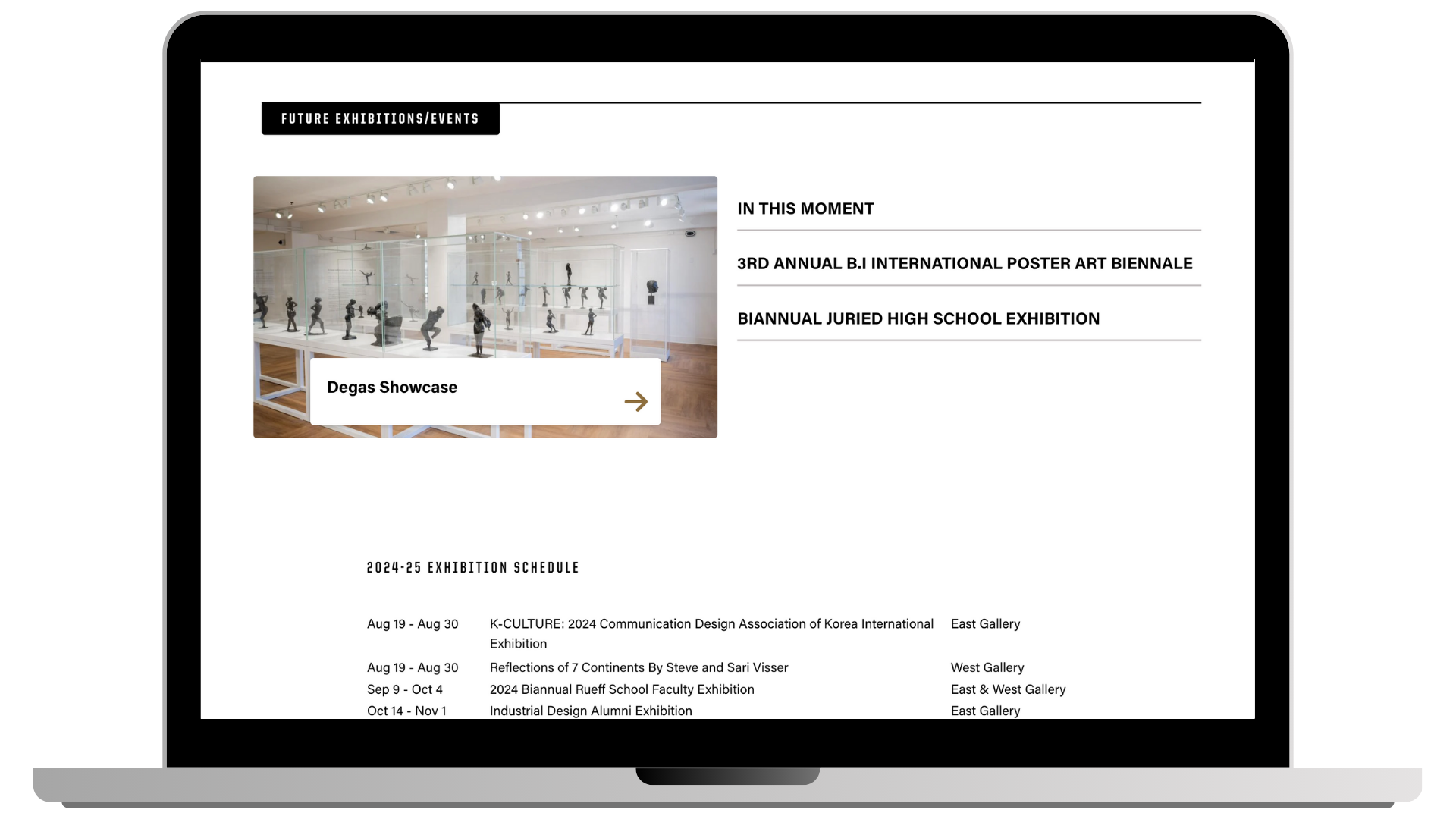
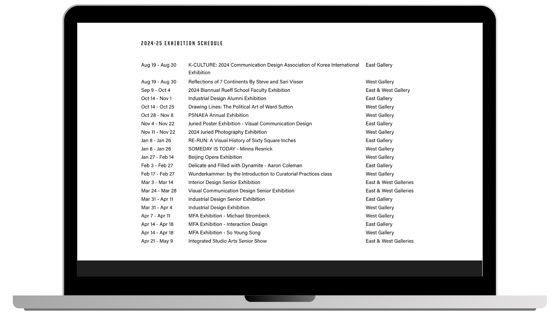
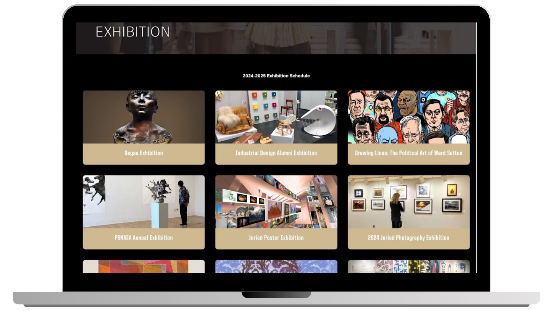
Exhibitions Page:
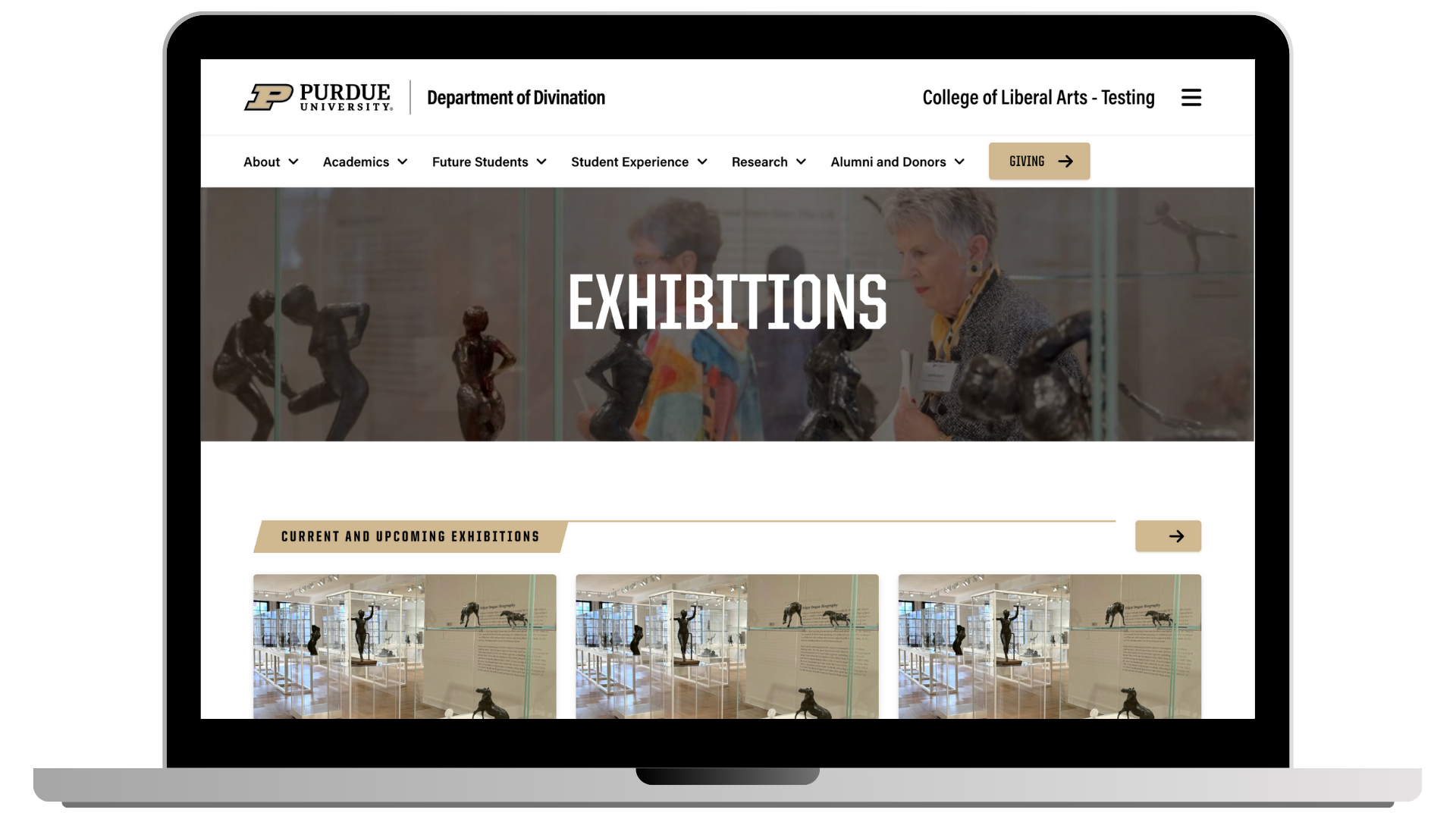
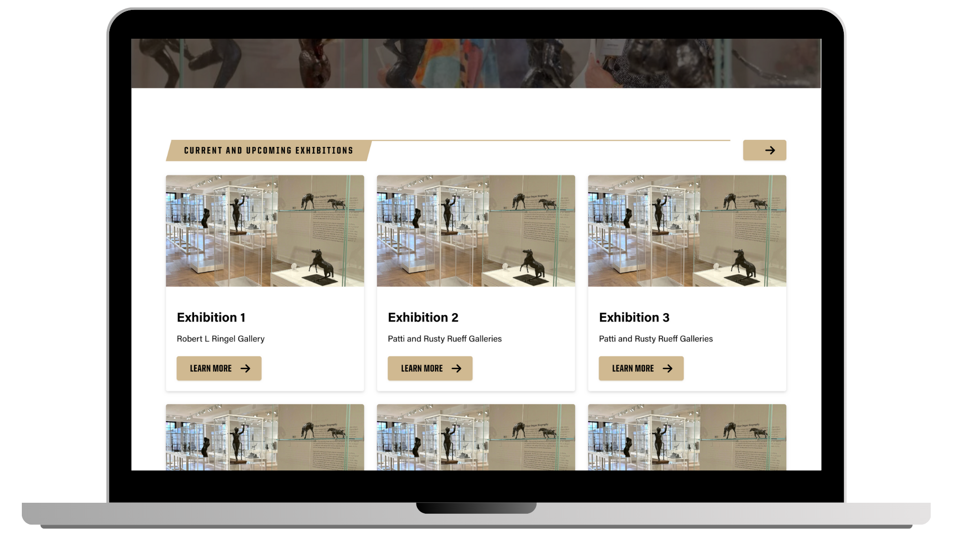
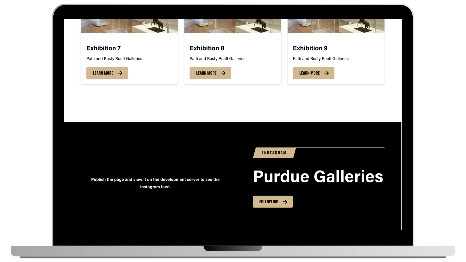
I designed this page. A centralized page where students and visitors can view current and upcoming exhibitions held within the galleries.
Individual Exhibitions Page:
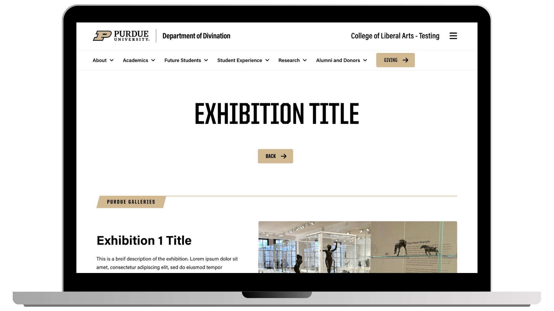
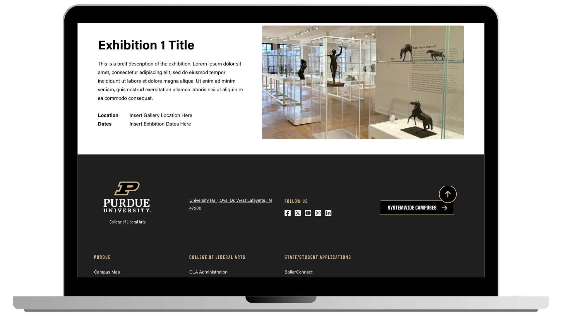
I designed this page. A detailed page accessed by selecting a specific exhibition. This page provides:
- Relevant dates and timing information
- An overview of the exhibition
- Images of the gallery space
- The exhibition’s campus location
Our Goal
Improve usability so visitors can quickly find current and upcoming exhibitions
Enhance the visibility of exhibitions to increase student engagement and awareness
Align the website’s visual language with the creative identity of Purdue Galleries
Who We Are Designing For
Purdue students, campus audiences, visual art students, art lovers
Internship Milestones
To structure this internship into clear, actionable goals, I established three key milestones to help guide my progress.
01.
Research
Conduct Primary and Secondary research. Identify pain points of the Purdue Galleries website.
02.
Sketching & Protoyping
Begin ideation on features and consider improvements for the website. Develop sketches into a tangible product via code.
03.
Cascade Implementation
Develop necessary page templates for the Purdue Liberal Arts Team for real use
01. Research
Research and Discovery
Primary Research:
Interviews with College of Liberal Arts students, art enthusiasts, and Purdue Gallery staff revealed that the gallery often struggles to attract visitors, with many participants unaware of current or upcoming exhibitions.
Ethnographic observations showed that the galleries were frequently empty, highlighting a lack of attendance. Survey responses indicated that most students visit the galleries only for specific, known events, rather than regularly.
Following our primary and secondary research, we held a co-design session with two students heavily involved in the art scene to better understand our stakeholders’ experience when navigating the Purdue Galleries Website, while also gaining valuable information through their ideas of potential design solutions. We were able to identify several pain points.
Below are screenshots of the most prevalent issues on the Purdue Galleries website
Pain Points
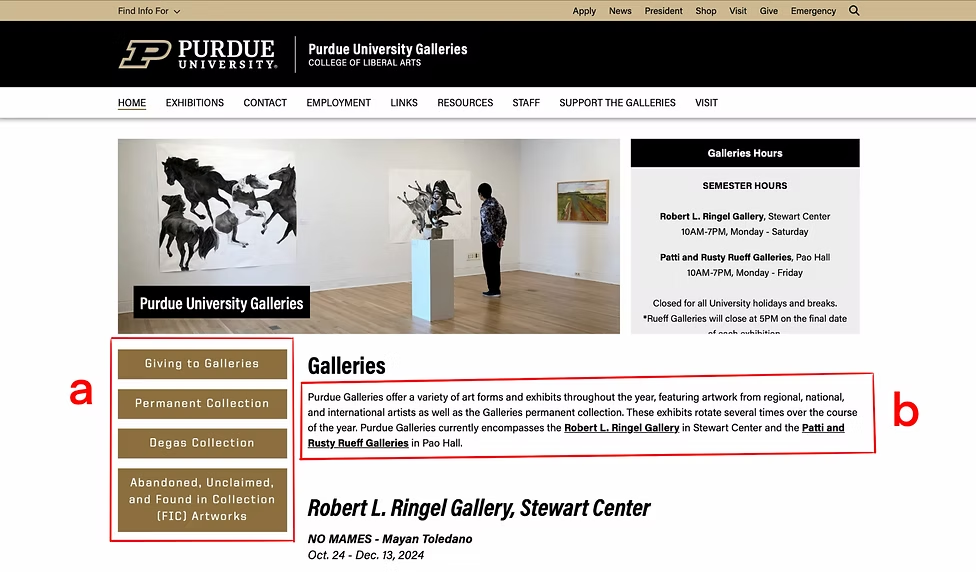
a. Confusing and irrelevant navigational system
b. Small text on the main page adding to clutter and information overload
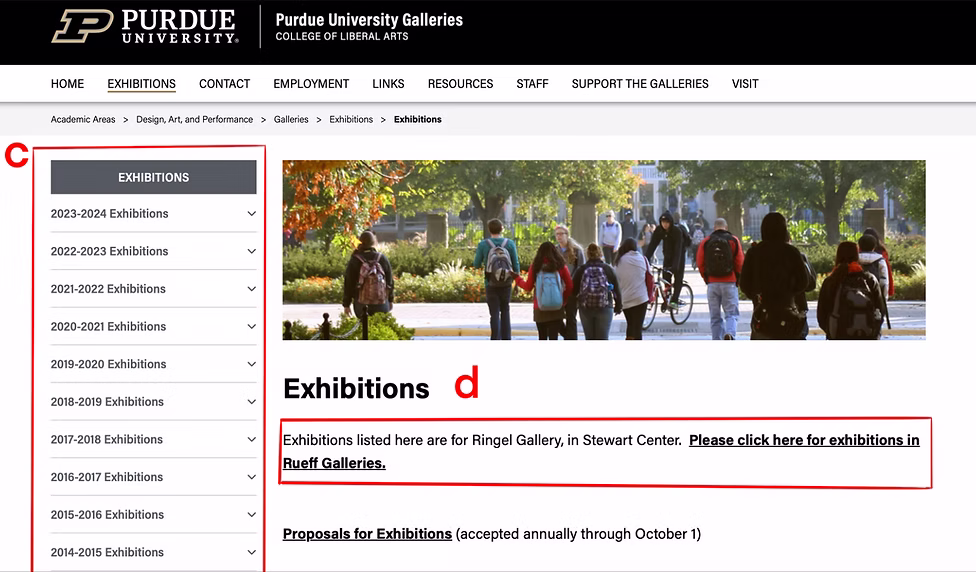
c. Expected to see the current and upcoming exhibitions happening around Purdue, not an archive of all of the past exhibitions.
d. Overlooked the small text towards the center of the screen that would allow them to navigate
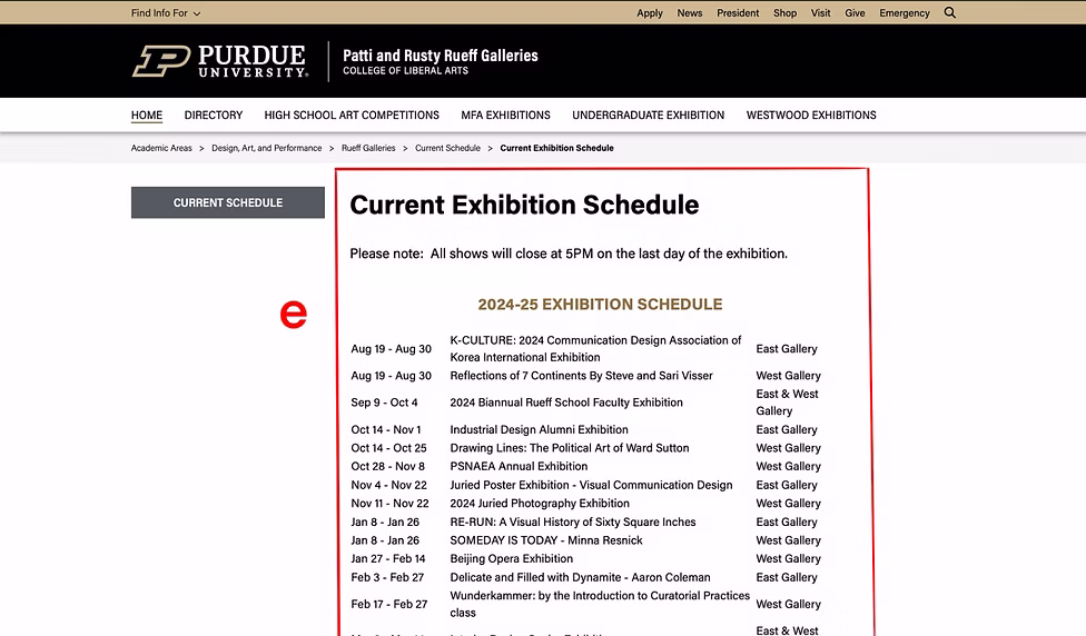
e. Lack of minimalist organization and information overload
Co-Design Conclusion
Uclear Structure and Organization
Students frequently struggled to find the information they needed on the Galleries website, leading to frustration during usability tests.
Visual Style
Many users, particularly art and design students, felt that the website’s visual style did not capture the creative identity of the Galleries.
These findings helped us develop our primary user persona:
User Persona:
“Dave was walking in the Stewart Center when he stumbled across the Robert L Ringle gallery. He decided to explore what the gallery had to offer. He really enjoyed the exhibition, but when he went to the Purdue Galleries website to learn more about upcoming exhibitions, he struggled to find information about their upcoming events and new exhibitions, as they were difficult to locate on the website and were presented in a poor manner. Dave left the site feeling frustrated.”
Comparative Analysis
To better understand how similar galleries conveyed their information, we conducted a comparative analysis of four platforms, ranging from professional galleries to university-run galleries, to identify industry standards and UX patterns. The analysis focused on:
- How current galleries promote their exhibitions online
- How galleries present their collections
- Use of buttons over hyperlinks
Together, these activities informed key design decisions and revealed opportunities for how we could improve the Purdue Galleries Landscape.
02. Sketching & Protoyping
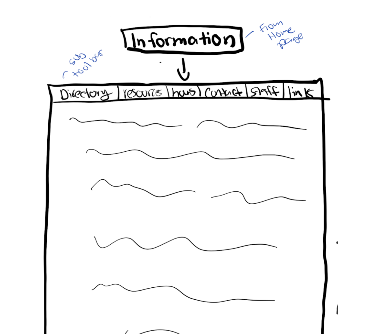
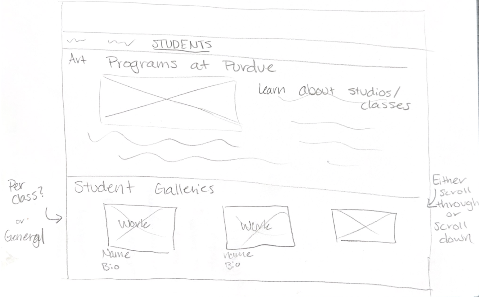
Sketches from our team’s ideation phase.
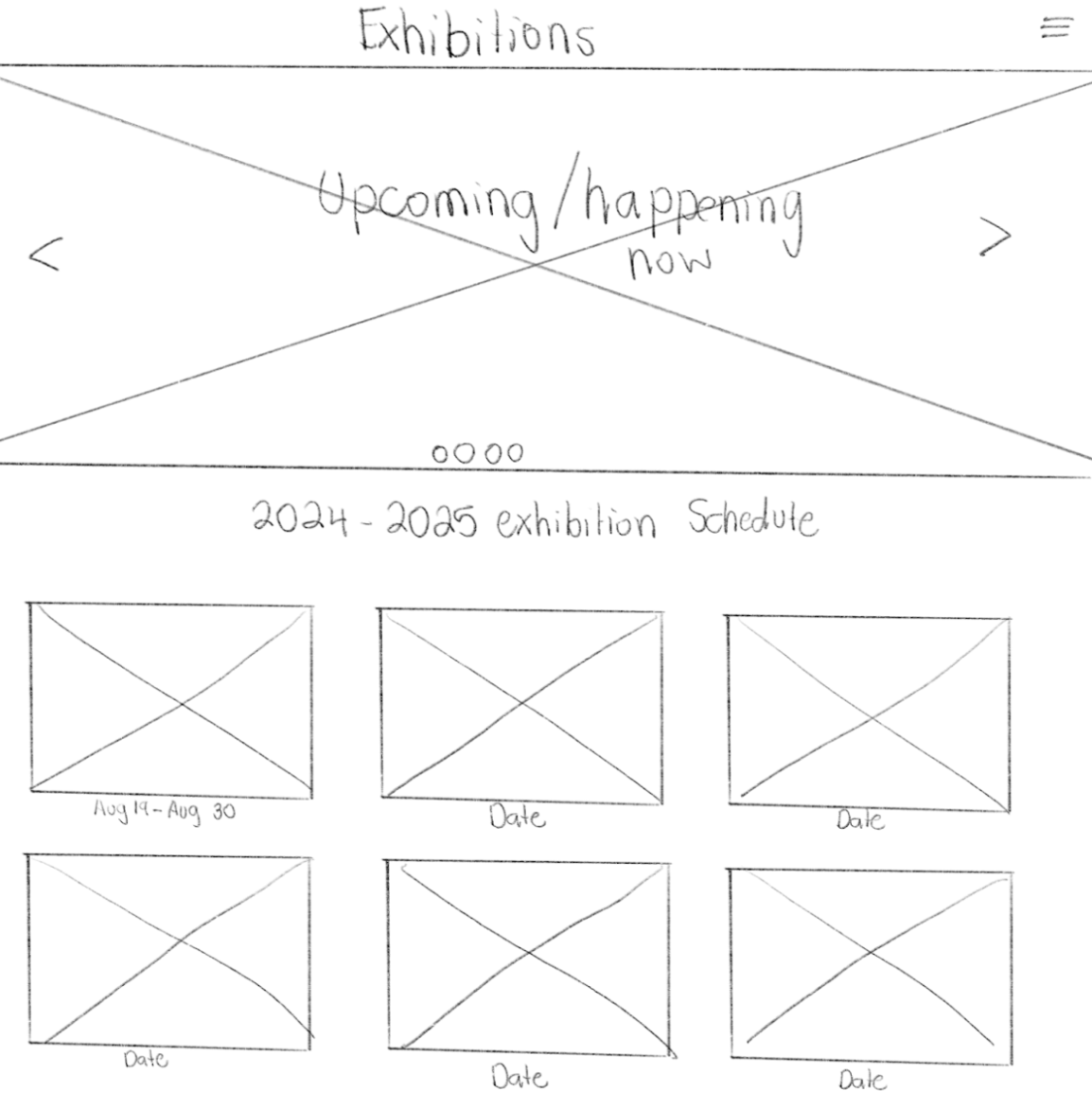
Following our sketches, our group worked on prototyping our idea using HTML and CSS within Visual Studio Code. Below is our coded version of each page. I coded the Exhibitions page.
03. Cascade Implementation
At the start of our internship, our sponsor connected us with the College of Liberal Arts (CLA) web developer, who was creating new templates in Purdue’s CMS, Cascade. As UX designers, we were asked to evaluate these templates while using them to recreate our designs for Purdue Galleries
- Reviewing and assessing Cascade templates as part of the design and implementation process
- Evaluating the CMS against web and UX best practices
- Identifying platform limitations that influenced design decisions
- Collaborating closely with the CLA web developer to support iterative improvements
- Contributing insights to Purdue’s broader web development efforts
Both Cascade and the templates had several limitations. Our team made adjustments to our designs to ensure they aligned with the platform’s constraints and Purdue’s branding guidelines.
Final Design
The final design delivers a clear, user-centered experience that makes gallery exhibitions easy to discover, understand, and navigate. By addressing issues of visibility, information hierarchy, and visual identity, the solution encourages more consistent engagement with the galleries.
Key improvements include a streamlined landing page, a centralized exhibitions page for current and upcoming shows, and detailed individual exhibition pages that provide essential information at a glance.
Clear navigation, button-based interactions, and a refreshed visual system help guide users efficiently while better reflecting the creative identity of the Galleries. This design balances usability with expressive visuals, ensuring the experience is both intuitive for first-time visitors and engaging for returning users.
Thanks for Reading!
Let’s Get in Touch
madiloyd@icloud.com
